Stop 2 of 6Must-see
The facade: a grid and an empty wall
Where to stand
In front of the main facade, roughly at its center, about twenty meters back
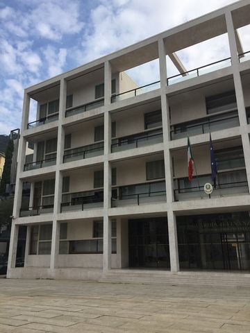
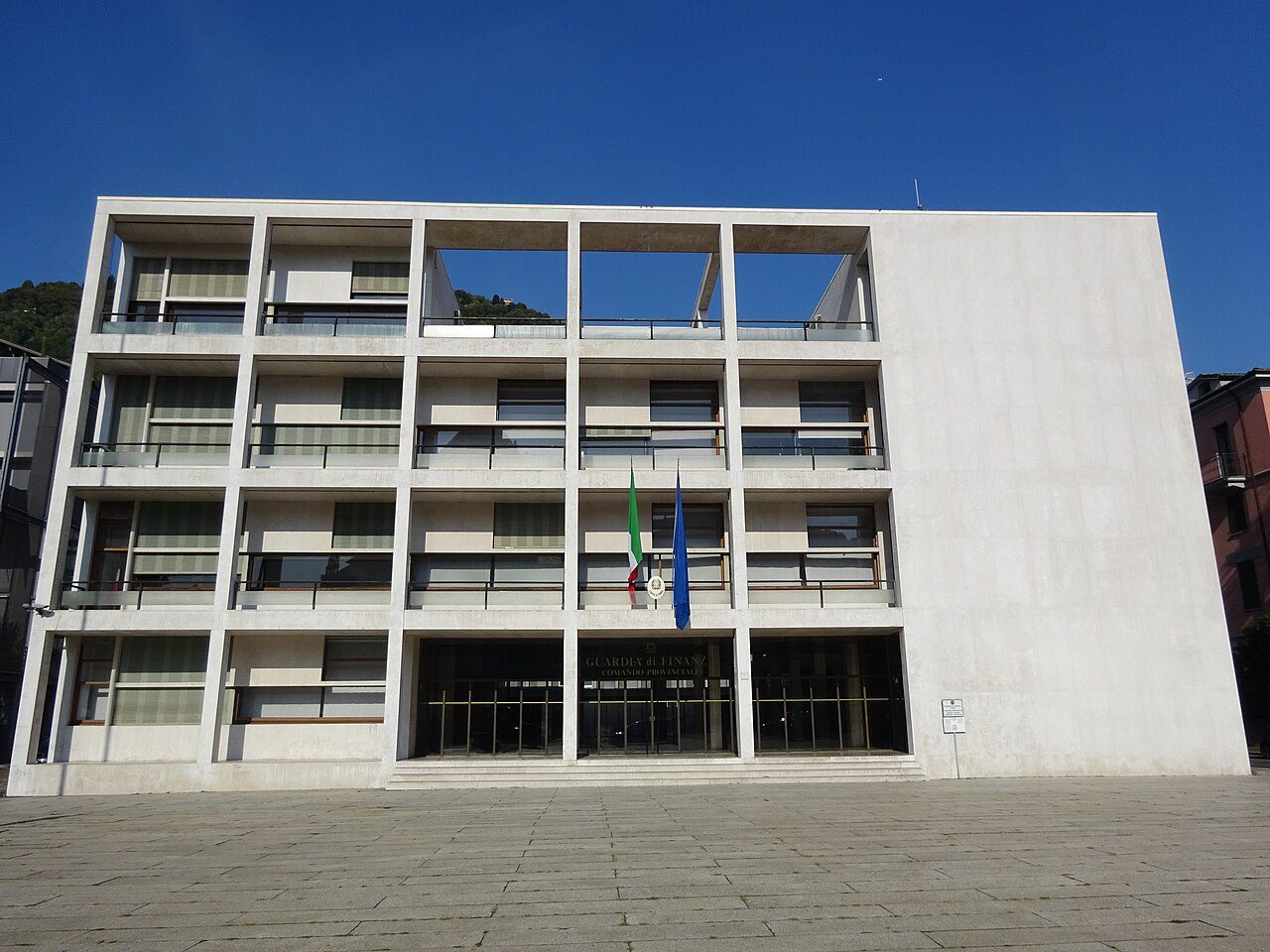
Beams and pillars in plain view, like a skeleton. On one side the , all voids; on the other, to the right, a large solid wall. That wall was never meant to stay white.
Spot the detail
Search the solid wall for an inscription, an emblem, any mark at all
The full story
A facade usually hides how a building is made. This one flaunts it. Look at the open part: vertical pillars, horizontal beams, and emptiness in between. It is a five wide.
The reinforced concrete skeleton, clad in marble, becomes the very design of the facade. The effect is of a building hollowed out, with air and light passing through it.
The tower that isn't there
Then shift your gaze to the right. There the grid closes into a solid, smooth band as tall as the whole building. Behind it is the corner with the main staircase.
But that band is also Terragni's answer to a political problem. The clients found the design not nearly monumental enough. They expected a , the lictor's tower that marked Fascist party buildings, a portico, at least some decoration on the front.
The architect tried drawing them, without conviction. In the end he only hinted at the tower: it is that compact wall, absorbed into the volume instead of soaring above the roof. No balcony for speeches, no Roman arch.
The screen left blank
The wall was not meant to stay empty, though. Terragni conceived it from the start as a great screen. In 1934 the graphic designer Marcello Nizzoli was commissioned to fill it with enameled panels: photographs of moments in the regime's history, slogans, and above everything a portrait of Mussolini larger than the other images, his gaze fixed on whoever stood in the piazza.
Giovanni Marinelli, the party's administrative secretary, was doubtful from day one. Years of versions, changes and postponements followed. The panels really were manufactured. They never went up on the facade, and sat for years in the city's storerooms.
Proportions and tradition
Then there is the matter of proportions. Terragni was keen to let it be known that the facade follows precise numerical ratios and a geometric rule used in the Renaissance. It was his way of saying that was not a break with Italian tradition: it carried that tradition on in other materials.
Keep this in mind as you look. The white wall we admire today as a model of purity is also the outcome of a piece of paperwork that ended badly.
About this stop
In culture
Forty years on one facade
The American architect Peter Eisenman has spent a huge part of his career taking apart on paper the Casa del Fascio in Como, the Fascist party headquarters designed by Giuseppe Terragni in the 1930s. His first studies come out in 1970 and 1971. In 2003 he publishes a volume on two of Terragni's works in Como, this one and the Casa Giuliani Frigerio, presented by the publisher as the fruit of forty years of work. His idea: windows, solids and voids can be read like the signs of a text, leaving function and history aside. It is one reason the Casa is among the buildings architects study most.
A party headquarters was expected to have a tower, a balcony for speeches, a few Roman-style arches. In Como too, the clients found the design not nearly monumental enough. Among Terragni's drawings are half-hearted attempts to add a , the lictor's tower of Fascist buildings, a portico, some decoration. In the end he built a pure volume and gave the role of the tower to the solid band of the facade, absorbed into the building. It is one reason the Casa looks so little like a regime building.
Next stop
Walk up to the foot of the entrance steps